You may not realize it, but some of your favorite businesses may be manipulating you when you browse their sites. They use eye-catching graphics and other tricks to encourage you to make choices you might not otherwise make. Usually, you don’t even realize you’re being pushed into taking a specific action.
Often the pressure to buy or sign up for something is subtle, and it's very common, especially among online retailers. To avoid being manipulated, you need to recognize the signs that a marketer is trying to prod you into making a specific choice – and once you recognize these signs, you’ll be surprised by how often you’ll find them. These are the seven most common marketing tricks.
1. Directing you to make the “right” choice

Deceptive marketing is all about misdirection. The things retailers want you to click will look very appealing, while those that retailers don’t want you to click on will look less appealing.
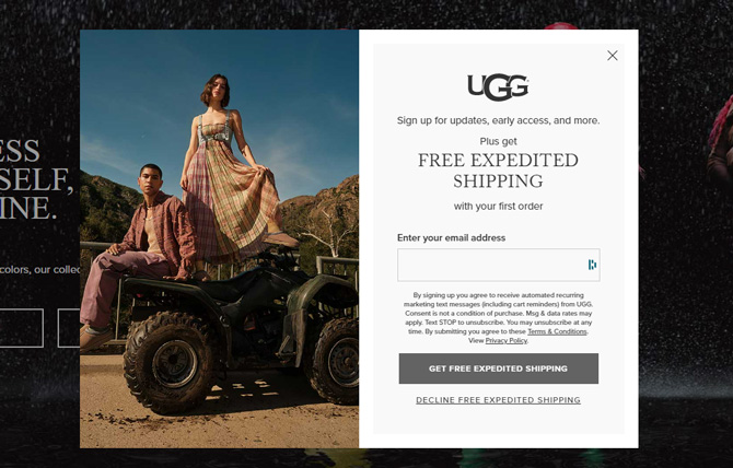
Misdirection can be achieved with visual tricks, like having the “subscribe” button be large and brightly colored while the “cancel” button is in tiny text that you’re likely to ignore. As a result, our eyes – and clicks – are drawn to the button rather than the less-emphasized alternative.
But some retailers use text to push you into a choice by making one option sound right and the other sound wrong. For example, a pop-up window may invite you to sign up for a retailer’s newsletter if you like saving money. Of course you enjoy saving money, so entering your contact information seems like the right choice. Unfortunately, the alternative is presented as wrong, so to avoid signing up for this newsletter, you might have to click “I don’t like saving money.” It feels foolish, and you may feel pressured into giving up your personal information.
Websites can also influence you by making the options too complicated to understand easily. For example, text may include double negatives to make you think they say one thing when they really say another, and boxes may be automatically checked (or unchecked) without clearly explaining what they mean. When you don’t fully understand what you’re clicking, you’re probably doing what the retailer wants rather than what you want.
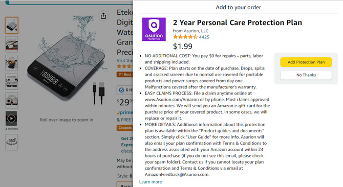
These tactics aren’t just used to get your email address and contact information – similar techniques can encourage you to buy pricy accessories, expensive warranties, or upgraded and more expensive products.
Keep your eyes open for these tricks, and don’t let retailers tell you where to click.
2. Sneaky shopping cart additions

Some retailers may add items to your shopping cart without your knowledge. For example, they may automatically add items commonly bought together to your cart, but the deception can be more subtle, too. For example, there may be a checkbox – that’s pre-checked – to add common accessories to your cart when you click to buy an item, or you may be presented with a button to add these extras to your cart that you click without really thinking about it.
For example, you might see this with HDMI cables when you buy a new television or with extended warranties when you buy electronics, which could be unnecessary costs.
3. Hidden costs and hidden subscriptions
Let’s say you’ve spent a half hour browsing a retailer finding the perfect product for a great price – but when you go to check out, it’s a lot more expensive than you thought it would be. While you probably expect taxes and shipping fees, you may be surprised by handling fees or other added costs. But because you’ve gotten this far, there’s a good chance you’ll checkout rather than start the process over at another retailer.
Another sneakily added cost is the hidden subscription. In this case, you’re signing up for a reoccurring subscription at checkout when you’re led to believe it’s just a one-time fee – or even completely free. These subscriptions may not show until you reach checkout and are often hidden in the fine print. Many subscription services work like this, offering a free or discounted initial subscription but signing you up for an ongoing fee that you may overlook until it shows up on your credit card bill.
Remember to look for checkboxes that may let you turn off auto-renew features or make a note to cancel your unwanted subscription before you get billed.
4. Encouraging impulse buys

Some online retailers pressure you to make a decision immediately, without thinking it through. This stress inevitably leads to spending more money than you intended because of pushy sales tactics.
Shops may do this by telling you an item is almost out of stock or saying a sale will only last for a limited time. If you’re tempted to click buy, remind yourself that you never need to buy right now to get a good deal. Items will eventually be back in stock, and new sales will inevitably come around.
Other retailers take advantage of your fear of missing out by making their products seem popular or in demand. They stress how much other people love their products by including testimonials or listing how many times a product has been viewed or purchased. In many cases, names (and even locations) are attached to these messages, like “Joan from Los Angeles just bought this,” adding an extra dose of realism. But these messages might not be based on actual sales or inventory data. Testimonials can be vague and unsourced, while view or purchase numbers could be entirely fabricated.
Don’t fall for these social tricks – avoid impulse buying.
5. Hiding the price until the end

We’re used to seeing a price tag next to a product’s description – but not all retailers make their prices that obvious. In this case, you may have to click through several screens to see the cost of an item.
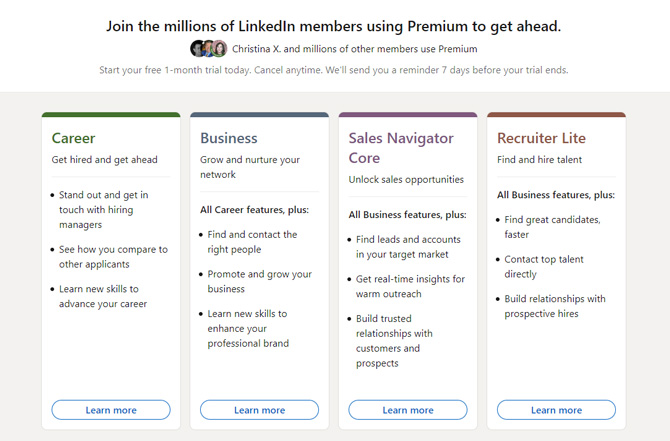
Hiding costs is common with subscription services with multiple price tiers. The tiers may be complicated and not show prices until you click the buy button, which makes it difficult to compare what you’re getting for your money.
If it’s a struggle to figure out what a product costs, maybe it’s just not for you.
6. Making it easy to sign up and hard to cancel
It’s always simple to sign up for things, whether it’s a new streaming service or a monthly subscription box. But if you decide a product isn’t for you, it may not be easy to cancel. You may be required to navigate multiple cancelation screens, and at each step along the way, you may be manipulated into making the wrong choices.
For example, the option to cancel a subscription may be tiny gray text at the bottom of the screen, while the opportunity to continue a subscription may be a huge, brightly colored button. It’s easy to click the bright button without ever realizing you haven’t canceled. Some retailers will require you to contact customer service directly to cancel, with no way to cancel online easily.
Sometimes, the cancelation process can be so frustrating or confusing that you keep paying. If you’re trying to cancel a subscription, don’t be intimidated by complicated, confusing options: keep at it until you’ve managed to cancel.
If you decide to sign up for trial subscription or membership, make sure you find out how you can cancel before signing up.
7. Requiring account creation before you browse
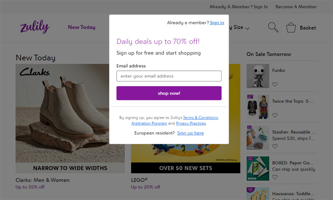
One particularly annoying retailer trick is forcing you to create an account or share information before you can browse. That means the retailer immediately has your contact information to fill your inbox with ads and sales to tempt you into spending money – all before you’ve even been able to browse the product catalog.
Requiring you to make that commitment up-front – even a small one – can make you more likely to buy. After all, you’ve already invested this much effort just to browse, so you may as well buy something.
3 tips to help you avoid deceptive marketing
Even though you know what you’re looking for, it’s still easy to fall prey to deceptive marketing. But mostly, it comes down to three key points:
- Read before you click. Be sure the button you’re clicking says what you think it says before you click, and take the time to read options and fine print carefully.
- Don’t let yourself be pressured. Acknowledge when you’re feeling rushed into a choice. When you’re pressured into making a decision, you’re probably not thinking it through, making it easy for you to fall for a trick.
- Don’t click if you’re confused. It bears repeating that it’s important to know what you’re agreeing to before you click – and some websites make it very hard to figure that out. So whether the prices are obfuscated or the options are excessively complicated, be sure you know exactly what you’re committing to before you click.
While there are a lot of different methods that marketers use to push you into making decisions that benefit them, taking it slow and avoiding impulse clicking to buy or sign up for something will keep you out of trouble online.
Laws may soon address deceptive marketing
Right now, the only way to avoid these manipulation tactics is to stay on your toes while shopping, but legislation is being considered to ban them. The Deceptive Experiences To Online Users Reduction (DETOUR) Act, which was first introduced in 2019, would ban these practices on large websites – particularly websites targeting children. Unfortunately, there’s not much movement on the legislation yet, but legislators are working on improving our online experiences. Until they succeed, the only thing we can do is be careful when we’re browsing.
Updated on 8/26/2022 with new examples and current practices
[Image credits: deceptive marketing via BigStockPhoto, screenshots of Ugg, Amazon, Hotels.com, LinkedIn, Zulily]
Elizabeth Harper is a writer and editor with more than a decade of experience covering consumer technology and entertainment. In addition to writing for Techlicious, she's Editorial Director of Blizzard Watch and is published on sites all over the web including Time, CBS, Engadget, The Daily Dot and DealNews.


From Frederick W on August 28, 2019 :: 2:00 pm
I make it a rule NEVER to order something and click on “Confirm and pay” in the same session. Leave the items in your “basket” for a couple of hours or overnight. If the order still looks good then, go ahead. Nine times out of ten you will decide that it’s something you already have, don’t want or don’t need!
Reply
From Judith on August 28, 2019 :: 3:09 pm
I put items in my cart, but do not checkout in the same session. Sometimes the retailer comes back with a lower price, but usually they hound you to death about leaving “something in my cart”. I absolutely will NOT shop with any company that makes me create an account before visiting their site. I will not complete a sale that requires me to create an account. I will not allow any site to retain my credit card information! Ever!
Reply