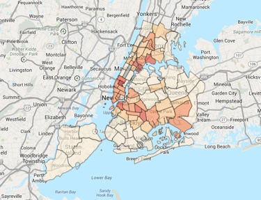
 Do you live in a safe neighborhood? You probably already have an idea, but that sort of thing is no longer something you need to cross your fingers about. The data is out there. And the New York City Police Department is taking a lead in brining that data to its citizens, unveiling the NYC Crime Map, an interactive web tool that lets you click around the city to see all its hottest spots for crime.
The Google-powered map is color-coded based on crime density – the more crimes per 1,000 residents, the darker the red color. You can bring up more detailed crime stats by clicking on an individual precinct. The upscale residential Upper East Side of Manhattan, for example, has seen 7 robberies, 9 felony assaults, 20 burglaries, 121 grand larcenies and 5 grand larcenies of motor vehicles for a total of 0.7779 crimes per 1,000 residents. The Times Square area, meanwhile, is home to a staggering 10.94 crimes per 1,000 residents, making it one of the most dangerous parts of the city.
The creation of the map is a result of a recently passed city law – one that other municipalities will hopefully follow suit in creating. It allows you to search and research individual addresses and zip codes. The larger map, meanwhile, may help you plan your next trip to the city – or at least clue you in on the areas where you should add a little bit of extra caution.
You can check out the map yourself by visiting maps.nyc.gov/crime.


