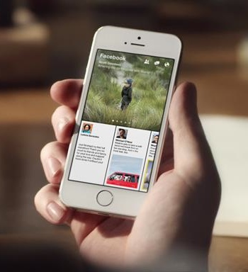
 The world’s largest social network is getting a smart new makeover thanks to a new app.
Facebook today announced the coming of Paper, a new iOS app it created for browsing and posting to the social network that emphasizes stories and design over the lowly gaming requests and everyday banalities that often clog it.
“Paper makes storytelling more beautiful with an immersive design and fullscreen, distraction-free layouts,” Facebook explained today on its official blog. “We’ve also made it easier to craft and share beautiful stories of your own.”
Indeed, like a newspaper, Facebook Paper is broken up into smaller themed sections. There’s a main, friend-oriented Facebook section, a Headline section for news, a Lens section for sharing photographs, a Tech section for Techlicious fans and more. Paper encourages you to build your own experience by choosing and arranging the sections as you please. Facebook algorithms take it from there to help keep the information relevant and interesting.
One major differentiator between the Facebook app and Paper is layout and design. With Paper, stories – even brief status updates – appear fullscreen. Tilting your phone while looking at a photo helps reveal more of the picture in a natural-feeling way. For larger stories, Paper will ask you to unfold "beautifully detailed covers" (think: opening a newspaper) using another new gesture.
You can see Paper in action by watching the promotional video from Facebook below. Paper launches at the Apple App Store on February 3; an Android version is to come.

From Daniel on February 03, 2014 :: 4:24 pm
Hi Fox!
I personally prefer a visual app like Hinto.co where I can pick out what I want to see, instead of being told what news to read by an algorithm. But I must admit, the video presentation of Paper is pretty impressive and the effects are very nice.
Cheers
Reply